Design & Projects
In my day to day work I fullfill a role as UX designer, but my story is much broader than that. My educational background is most recently coursework on UX- design at Noroff, but prior to that I started in political science, sociology and philosophy, ever trying to understand and model more and more of the complexity of our society.
Below I would like to share with you a small selection of coursework I have been doing, as well as samples from a couple of real world projects.
Healths Own
Taking science into account in a new meditation and habit tracking app.
As a designer I prefer working with a team. Teamwork allows us all to draw on our strenghts, and makes the work dynamic and a more happy experience. In addition, in all processes I have been a part of, members of teams have had outside life events impact their ability to work. Keeping the work going, making time for managing team dynamics and keeping everyone on board has been a crucial learning experience for me.
It was therefore a welcome task for me, when we were asked to design an app that could handle both habit- tracking, mood tracking and meditation. Both these aspects are part of the larger self care and self improvement culture that we are now experiencing - and also wits well with what an app can do. One of the more important things phones can do for us is to lessen the mental burden of planning and keeping track manually. Also the phone is always with us for other reasons, so adapting it to a life where one needs to take stock of goals, and also of mediation is a natural fit.
Below I’m going to take you through the process of making the design, to what extent we managed to make it work, and where in the process we could have made better efforts.
A beginning touch of Visual look and feel
In all earlier processes we have started with ideating around a baseline of research. However, in this case the brief was very clear, and in that sense some of the work had already been done. So one of the first things I did was to pick some colours. I wanted to have a good range of warm and cool colours to represent the cooler and warmer sides of ourself - and while we would still be doing very simple structural design choices, I wanted always to visualise the elements I was making as saliently as possible.

This untraditional approach allowed me to work “multi- modally” from the start, which is in tune with my normal mental processes.
Other elements shown in this image are some typographical elements. These and button layouts were added later in the process, but I feel it is natural to speak briefly on them here. As always there is som tension between style and usability. We did not want a super clean and simple look, but neither did we want anything ornate. Headlines were given a classical serif font, with thin vertical lines to convey dignity and connection to the past, while helvetica neue was chosen as the body type for it’s familiarity and legibility. Specifically the choice stood between helvetica and Inter, but I felt that inter needed more adjustment of kerning in figma, so the choice was made in favour of helvetica neue. Later we will return to look, and the choice for the buttons styling and the gradient on the background.
Theory and Structure

For applications where the goal is to aid on mood and habit tracking, one must have a good foundational understanding of the theory of emotions. For this my background in neurophilosophy was a good beginning point, where I was able to quickly and efficiently deal learn the domain specific knowledge needed. We ended up using a model of the emotions called the “emotional circumplex”, where emotions only have two dimentions. One dimention is exited - calm, and the other is the valence, which goes good - bad.
The strength of this approach is that it is so easy to model, and the problematic thing is that it makes little mention of particular emotions. Identifying spesifics, however, is a demanding task of the user too, and so I felt that in the initial design phase, the focus ought to be on mastering the basic theoretical framework in a practicable way.
This was the initial design. This minimalist approach we though would be a good starting point. The central idea is to track emotions three times a day, morning, mid day and night. This information would then trace a path in the design, an emotional journey, which could then be “stored” in it’s path like form as a disk which we could then save for the day. Over time you would be able to see where most of the emotional landscape you walked through would be. Would you be on the happy or sad side. Would you be a calm and content, or maybe understimulated and depressional?
Developing a design
We needed to develop this barebones idea into a workable prototype. To start, we wanted to bring in a feeling of natural light, and of calmness. For me this is well evoked by a single light source, filtering in through the windows. We therefore spent some time learning for the graphical trend of neumorphism, that emphasises a more nuanced use of light and shadow to separate out foreground and background. WCAG standards did not allow use to use a totally monochrome scale, but we still ended up giving highlights and shadows to almost all elements, with appropriate gradations. If we analyse the big center disk, we can see a drop shadow down right., and a highlight to the upper left. The disk itself also has a grade, but does not desaturate, but rather turns towards a bluer shade of inherently darker colour. This is to maintain a good separation with the background and make semi interactible elements stand out.

Interactive elements are mostly given colours from the warmer side of the spectrum to help them stand out.
In this image you are seeing progressively the mapping of emotions. From this screen it is not obvious how this would translate into seeing the whole week, but at least it is clear that something is happening, and we are producing something. While this is a clean an minimalist aesthetic, I think we failed in this instance to provide clear enough signs to the user of what the purpose of mapping emotions was.

The overview
To guide the user through a sensible use of self help apps, it is important to give them the correct feedback on long term trends. These are what helps regulate them and make them at ease that what they are doing is working.
In these two screens you can see our approach to this. The one on the right was made by me, but I do not think that this provided the best overview of long term trends. Skillfully on of my other team mates made this awesome analysis page, that gave really concrete and nice feedback over time. Sometimes text is in fact best, as it builds understanding in a more structured way.
I hope you took some tips, do’s and don’ts away from this presentation. Please feel free to send me an e-mail over in the bio section if you have any questions.
Droplet
I would like share with you some well crafted theoretical work that our small design collective performed recently. I want the focus to be on the early stage of the project, because I think most of the interesting work was made there, and we never had the chance to develop this into an actual functioning app. Nevertheless, I feel there are some learnings to be had.
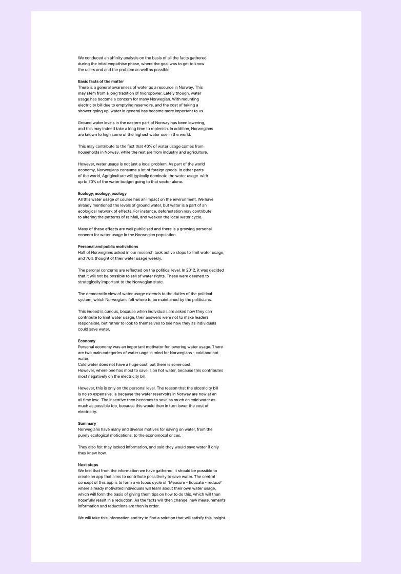
For this brief our assignment was very general. We were to do a project about water ecology and water scarcitty. With such an open brief we had to do a lot of general learning. We started to read papers, articles and absorb information, which we put into a research document, like this:

The scematical layout allowed us to quickly gain an overview. It is important to remark that general research is not knowledge that has been directed at something. We still had a long way to go.

The next step was to narrow down our research area into a place where we could actually do some good. To do this we conducted multiple brainstorming sessions.
Brainstorming like this is a lot like using the double diamond. The focus is opening up your creative space, then finding and feeling out what is intriguing. It is climbing the tree of though, and finding a branch. Then you can close off the other branches of investigation, and continue further.
We decided that, while industry has a large role to play, the best strategy for us would be to target the individual. We reasoned that an individual, who has an actual cost associated with their water usage, would be highly motivated to lessen their water use. But the real breakthrough was of a conceptual nature, when through analysis of the foundational nature of water usage, we came to this concept:

We had discovered evidence through our research that household where the water meeter was more prominently displayed reduced their water usage, and also that most norwegian households did not have water measuring at all installed. This opened up an opportunity for us, where we reasoned that if we were to give households a lot of information about their water usage, they would naturally learn to find ways to reduce water usage themselves. This could again be coupled with models of how their usage was now comparing to similar households, and what we thought that they could do to save water.
This concept was the structure we ended up building our app around, always thinking of how we could highlight savings and motivate lower water usage. In fact, this way of thinking made us aware that a lot of water usage also has a cost in electricity. Hot water usage must be taken from the hot water tank, which of course requires electricity to heat. By monitoring your habits, we could estimate what usage would be showers, then calculate by checking against the going rate for electricity what the monetary value would be for that shower.
Not to say that this was the only piece of work we needed to do. Not at all! Check out the picture carousel showing some of our work below.


I hope this picture carousel gives you some sensation of what it takes to get a handle of a problem, and to start working towards a solution that we are pretty sure would satisfy a need. In the end I do not want to show the results too much. The product in this case is the research. As UX designers we should resist the idea that all of the most important work happens in finalising UI. While UI is an important part of the job, this not the beginning and end of the responsibilities of a UX designer.
In the end I would still say that the central concept of use - measure -learn was the most important contribution we could make - however we could never have gotten there without all the foundational work we did before.
A final point. After this research I went back to my day job as a UX designer and had an epifany moment. I could use some of the same conceptual thoughts in my work project as I did in my studies. This work helped set a new direction for the team, and reconceptualized the function of our program - a kind of cross pollination of ideas between research and praxis that I did not expect, but which ended up helping everyone.
The Modular Design of Cyber
I had several specifications I wanted to achieve in this game — virtues, if you will, of modern board gaming. They included portability, beauty, modularity and multi use. The design I came up with shared many of these features, while expanding my ideas in some new interesting directions.

The games is made up of 7 tiles containing 6 triangular spaces each. The triangles create a unique geometry, where space has only 4 neighbours, but 6 directions in which to travel in a straight line. This new geometry breathes life into old games such as Petteia, checkers, and halma, all of which are adapted to new games on this board.
Because the board is modular, the plates themselves can be made part of the game. In one games based on Amazons, a territory capturing game, players may once per game move one of the plates to a new location!

In this match magenta has won 18 points to yellows 10. These games can be very short, averaging 7 turns per player. The obverse side of any piece is black, and is used in two games for different purposes.
Interestingly, though only one of the games made for this set is for three players, several games are played on fewer than seven plates, so simultaneous play with the same set is completely possible! There are games for 1, 2, 4 and seven players, so up to 14 players can play with a single set simultaneously!
In the end I made seven games for this system, each reflecting different styles of play. In some games the board starts empty and ends when it is filled up. In some the pieces are taken away, and in still others only locked away or used as highways. The key to making a successful game is to carefully design the decision space to be on the limits of understanding, so that it can differentiate between different player skills. Ideally, one would like the depth, or the skill sealing to be as high as possible, while still making the entry level as shallow as possible. For this purpose, most of these games have simple rules who’s combinations sum to the real difficulty.
In a way, that is one of the few things that is unified in all UX design - the relationship between the user and the object needs to be of a manageable complexity, while still providing enough variance to open up a possibility space beyond the trivial.
Aesthetically, the challenge will be to make the game as fresh looking as possible, while still aiding readability of an unfamiliar board geometry. For that reason the lines and background are black and white while the circles have a mid tone value.

piece colours are maximally different from any other colour, and provide an easy to see contrast. However, the obverse side is black, to hide captured stones and hinder them from affecting gameplay too much.
I hope that was an interesting look into the design. Feel free to ask me anything regarding this design exploration.
Politeia
This game is a work in progress. What inspired me to do this game was to see how terrain formation could be an integral part in the strategy of a game, as well as finding game rules that naturally created landscapes. These islands are meant to lie in the Aegean sea, and the geometric shapes are hoplites of various skill.
As the game goes on one builds the military, economic basis and strategic positioning. All to capture the last city of the enemy! Hoplite will be designed for two to three players.
Skakktafl
Skakktafl was the first game I designed. It takes it's inspiration from chess, go and hnefatafl. You control one of two armies, marching against your enemy. Each Piece is a little paper sculpture that must be assembled by the player before starting. Even the game board is a jigsaw puzzle that must be assembled and cut out.
This game is not, in a sense, commercially available. One can only access this game through assembling it oneself. All the instructions are in the manual, along with the rules and a strategy page.
Bastion
Bastion is my second game. The core of this game is equal pieces, but that work together to form new patterns on the board. The challenge here is the combinatoriality of the pieces. The board is not finalized. The design on the left makes for a defencive game, the one on the right favours offence. The manual can be found here.
Aspects of board game making
Making a start.
I started making games because I was intensely curious about how a few simple rules could combine to make a complex interactive system. I would learn about ancient board games were rules were not as developed, and then get inspired to make small modifications. My first few attempts were simple, but instructive, failures. The first one was a five by 11 grid, were single stones could form lines to propel themselves like cannonballs over enemy lines. Each stone could move one space in any orthogonal direction on a grid of squares. The playing mat was a laminated A3 sheet of paper filles with square grids, over which I drew different board sizes with a sharpie. Several of these games were tried out, but I could not seem to get them to work.
Trial and error.
The experience above is an important first step in a design. It stars with an impetus, a desire, a quriosity. But, after a while, that curiosity must develop into a lasting interest. The way to make a good board game, is to first make a bad board game, then slowly, through testing it yourself, and with friends, add and subtract elements until you have, what? What is a good game? Until you have, what you consider to be a good game. Not all games are fun at all time for all people; or even interesting at every turn. The ebb and flow of enjoyment seems to be like this: You can either have a game that is a pretty good time most of the time, or you can have a game which is thrillingly ecstatically enjoyable and rewarding, at least for one person, sometimes, or; if you are on the loosing end, a miserable time. At the first end of the scale we find games like "Cards Against Humanity", at the other end, poker and slot machines.
Rules as description.
What I mentally do, is to imagine some general way that I want the gameplay to be or to feel. For Skakktafl, I wanted the pieces to feel in one of two ways. They would either be part of making a shield wall, as the vikings would do to stop the initial charge of the enemy, or they would be heroic archetypes that convey a uniqueness. The flow of the gamplay was to be like this; I wanted to have impermanent barriers, like the pawns of chess, but with room for flanking. And I wanted the board to be big enough, and the pieces limited enough, so that there would be distinct areas of combat on the board. Which would force you to swich between thinking globally and locally; preferably nested like this; 3 decisions on the strategic level, 3 decisions on the tactical level. After I knew what I wanted, it was up to me to create a board and rules that created this effect.